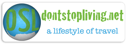
What’s in a brand name? What’s in a logo? What’s in a slogan? What’s in a font? Are these things really important in the big old world of blogging? As a professional travel blogger who has experienced the ups and downs of blogging, it’s time to have a look at why these finer details ARE important, as well as my personal documentation of my Don’t Stop Living brand, logo, font and story up to the present day where I reside in Warszawa, Poland. Here is the Don’t Stop Living official logo:
Why Fonts And Logos Are Important in Blogger Branding
1.The Importance of Brand Names
I have two main online businesses / blogs – this one and the other one. They are:
- Don’t Stop Living (A Lifestyle of Travel)
- Northern Irishman in Poland (Połnocny Irlandczyk w Polsce)
The first one, I chose the name as it became my catchphrase in life. I was backpacking in Toronto in 2001 and I saw the words in red, etched / grafittied onto a High School Wall. I jotted it down and then when I launched my travel blog in 2007 (ironically also from Toronto, Canada), there was only one name on my mind – Don’t Stop Living. Hashtag the beast #dontstopliving
Don’t Stop Living logo
2.The Importance of Logos
As a Northern Irishman, I love the colours of green and white as it represents our football team. Our away kit is also sometimes blue and we originally wore blue (before playing Scotland and realising the problem). So when I had a logo in mind, it was always going to be green and white. Then when I thought about it – I am a travel blogger and I had visited 16 countries when I started this blog (crazy that in the last 14 years that number has now risen to 169). This gave me a lightbulb moment to use blue as well – the green for land, blue for the oceans/sea and white for clouds/Antarctica and so this logo was born and I had a few versions before going with one designed by Scott at Eldo Design in England.
An early self designed DSL logo
3.The Importance of Slogans
Your slogan needs to be easily understood and usually quirky, catchy and short. I am not saying that my brands “Don’t Stop Living – a lifestyle of travel” and “Northern Irishman in Poland, Połnocny Irlandczyk w Polsce” are amazing. They are not. But they are both easily understood – the message of the slogan is clear.

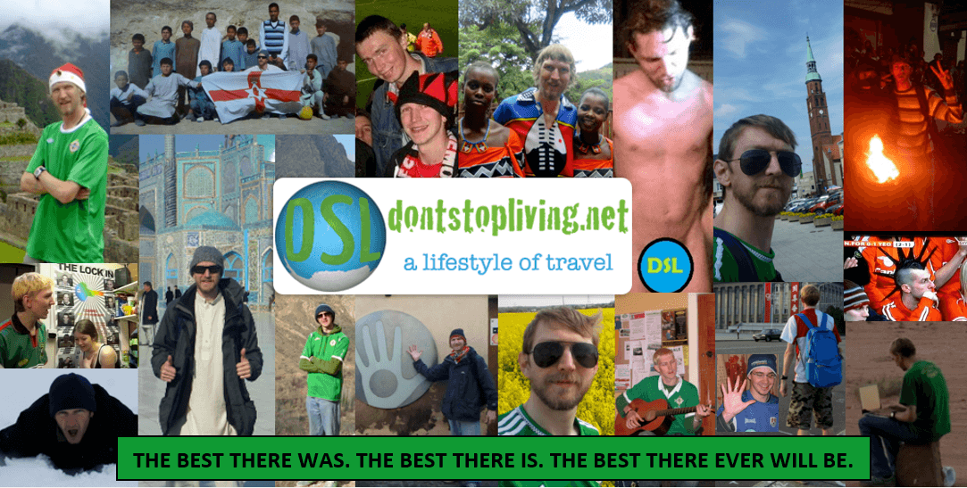
Don’t Stop Living – feeding hyenas in Ethiopia
Don’t Stop Living – a lifestyle of travel is about a personal who bases most of their life and lifestyle on travel and doesn’t want to stop living. It’s about living life to the full and travelling around the world. It is also about the ups and downs of that journey, so even in the bad times, the writer of the blog wants to “not stop living”.
Don’t Stop Living – a lifestyle of travel
Northern Irishman in Poland, Połnocny Irlandczyk w Polsce – sorry but this one is really obvious!! It is a blog about a Northern Irish guy called Jonny who lives in Poland. It’s that simple. I also translated it into Polish for a few reasons – to attract Polish speakers, to help interact with Polish people, to help improve my Polish by constantly having to write it and also to educate those around us. It’s nice to have that balance. I also interchangingly use the word Ulsterczyk as a (n incorrect, I know) synonym for Połnocny Irlandczyk.
Northern Irishman in Poland / Ulsterczyk
4.The Importance of Fonts
One thing that is really often overlooked is just how important a font can be! Yes, fonts have a personality of their own and just from the writing style and font used, people build up a intrinsic, automatic opinion of what the brand might be about. I chose a font which looked like a person travelling and writing. I really feel that when I look at my logo. Look at my fonts used here, the “Don’t Stop Living” bit is about travel and the “A lifestyle of travel” bit is actually about writing. They fit together…
dontstopliving.net – a lifestyle of travel
It really works. You might also wonder why I put the top font as one word “dontstopliving.net” instead of merely “Don’t Stop Living”, well it’s because I wanted people to not sure say the phrase but to visit my website. And because my website was not .com , then I needed to stress the .net bit. In fact, I wouldn’t want dontstopliving.com . The .net bit works better for me.
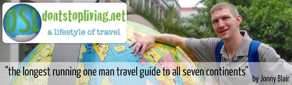
Dont Stop Living A lifestyle of travel banner header
The second bit is in lower case and this is because as a writer, we are never finished. The “a” is not the start of the writing, nor is the “t” the end of the writing, therefore no full stop is used, required or desired. As well as using the many fonts available on your computer, you can also get a Free Font Download to meet your needs, and plan your logo from there. Trust me, the brand, the logo, the slogan, the font – it is all important to me.
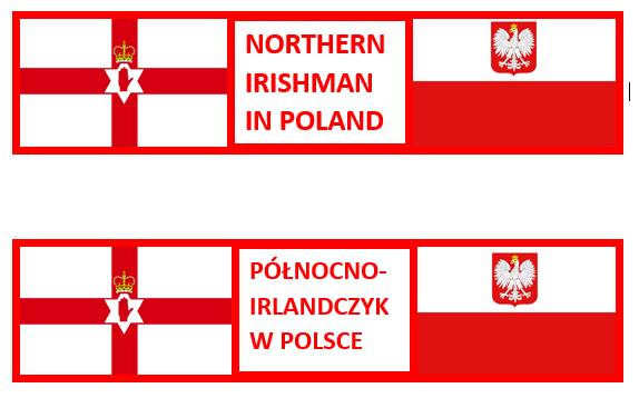
Northern Irishman in Poland, Połnocny Irlandczyk w Polsce
With my Northern Irishman in Poland project, I decided on a bold upper case more simple statement.
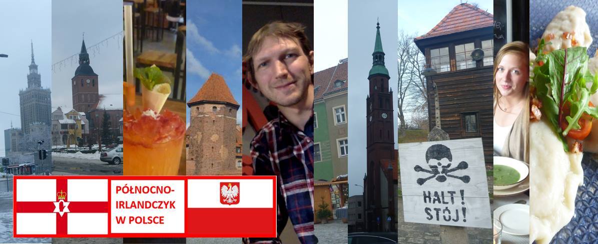
Northern Irishman in Poland, Połnocny Irlandczyk w Polsce

Northern Irishman in Poland, Połnocno Irlandczyk w Polsce
Northern Irishman in Poland, Połnocny Irlandczyk w Polsce
- as you can also tell I am still unsure whether to use Połnocno Irlandczyk w Polsce or Połnocny Irlandczyk w Polsce. The “y” at the end ensures the adjective is masculine, but then again the word Irlandczyk already should confirm that. However the “o” at the end gives it a quirky feel, the way we say “Sto lat Polsko”.
5.The Importance of Colour
As I mentioned, DSL uses green, white and blue which to me fits the brand to a tee. It’s almost snow white perfection. It’s pure, clean and free. With the newer project (Northern Irishman in Poland, started December 2016), I decided to use the flags of Poland and Northern Ireland. There are many reasons for this decision. One is that they are two flags that I personally recognise. Many people don’t recognise Northern Ireland as a country, many wouldn’t even recognise the flag if you showed it to them. Many Polish people prefer the flag without the eagle in the middle. But I like it. The eagle is the national symbol and bird of Poland so I use that one. The great thing is that both flags are majority white and red and both have a symbol in the middle. It works and they also match to the name of the blog exactly, and in the right order. Who am I? Who is Jonny Blair? He is a Northern Irishman in Poland…simple but true. Therefore not only did the flags have to be white and red, but the writing and the logo had to match. It works now. I’m proud of that! I also have a flag logo with country maps on them…
Northern Irishman in Poland, Połnocny Irlandczyk w Polsce
All in all, remember this is YOUR brand and will set up your blog and following for days to come. Don’t mess around with your logo and fonts once you have them set in stone. People start to recognise them and then they know it’s you.
Safe travels!!
Safe travels everyone!
Fonts are incredibly important for branding in general, not just blogger branding. For example, most big corporations out there have opted recently for sans serif fonts that are very clean looking and crisp, perfect at small and larger sizes and easily distinguishable.
Hi Eddy, Thanks for the comment and for checking my website. Apologies for the delay in response. Unfortunately I have been suffering from long-term depression caused by a liar and I wasn’t checking all comments and messages or replying. I hope you enjoyed my article. Stay safe. Jonny